In October 2018, Jess from Mac & Moore reached out to me and asked me to collaborate with herself, Nat (the other half of Mac & Moore), and Founder Angie on a re-branding and re-positioning project for in Deptford, London. Mac & Moore are a plug-in marketing duo for startups who I have had the pleasure of working with closely for the past year or so.
We worked closely with Angie, the Founder of The Yoga Room (previously Vinyoga) who has created such an amazing community space in the heart of Deptford. The Yoga Room has already become so much more than a yoga studio, an integral part of Deptford’s community.
As an avid yogi myself, this was a bit of a dream project for me! It would be an understatement to say that I was excited to work on a project within the wellness and health sector. Being a part of building something that is doing such good for people’s mental and physical wellbeing has been a bit of a work highlight of mine so far. Seeing the branding come to life in a physical space and all of the hard work from myself, Mac & Moore and particularly Angie put in, was well worth the wait.
A bit about the branding…
What may look like from the outset like quite a simple brand identity, takes so much work behind the scenes to get to the stage you are seeing it at now. Six initial concepts got narrowed down to one final route, which was then developed, tweaked and built out into the final identity design. A huge (and arguably the most important) part of what I do when designing a new identity for a business is rooted in the initial research and development of the first concepts. You can see this from the inspiration behind the logo, which is drawn from the idea of a circle as a device to represent unity, wholeness, community, the self, centredness, and the idea of a central point of the community. The Y is also an abstract yoga pose.
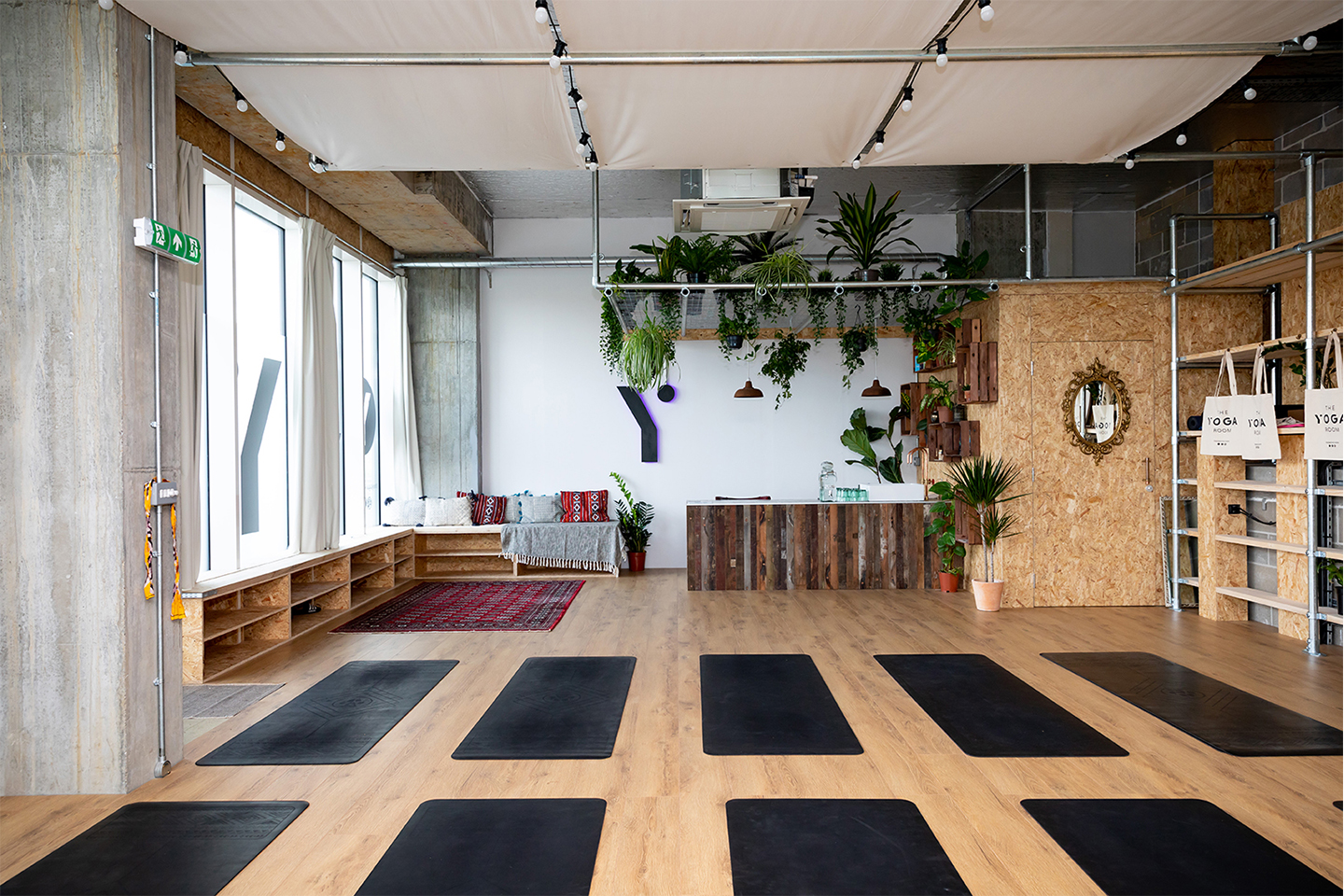
A brand, I believe, is so much more than what you initially see on the outside. It is how it makes you feel too. I wanted to create an identity that reflects The Yoga Room’s core message and values and also creates a feeling of community and togetherness, and helps people to feel as if they are part of something when being there.
I built the identity out onto a number of touch-points, including: the physical space, merchandise and printed materials to help bring the brand to life.
Seeing the result of all of this work behind the scenes finally be bought to life via some amazing photography (shot by the brilliant Vivian Birch photography in July) really helps to bring the vision Angie, myself, and Mac & Moore had for The Yoga Room to life. These kinds of projects are really what drives me to do what I do, and why I love it so much. Seeing a Founder’s vision being realised and being part of making that happen is so rewarding.
Good luck to Angie and The Yoga Room, it’s been a pleasure working with you – Namaste!
