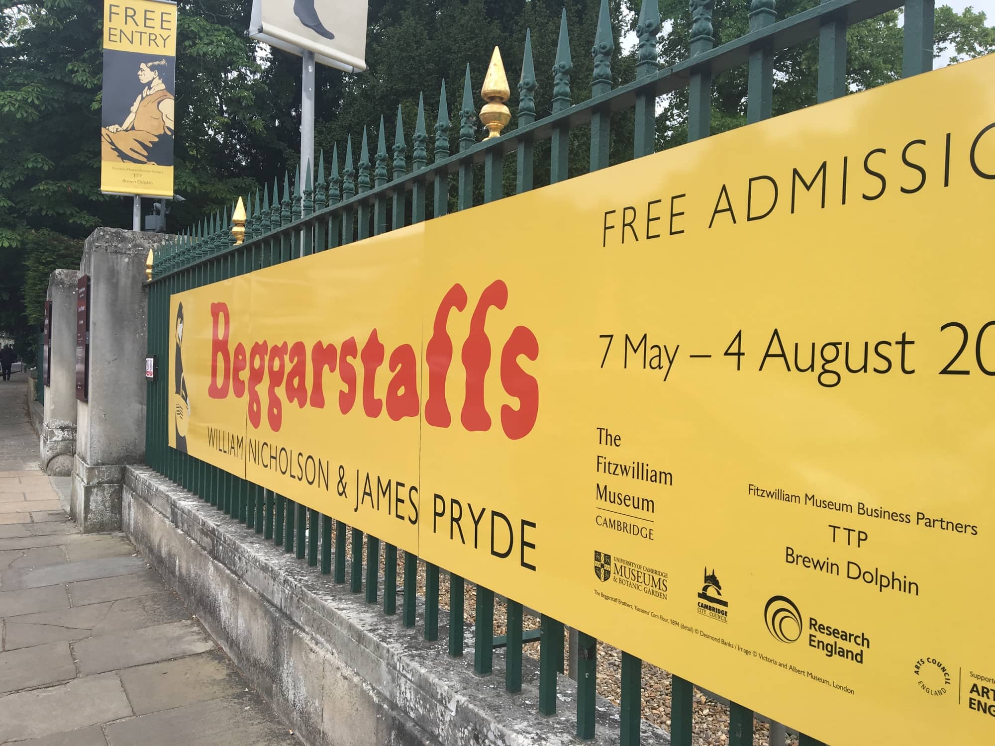
Both artists went their separate ways later in their careers to pursue painting. The progression from graphic posters to painting was interesting to me as it seemed like a ‘backwards’ progression compared with other artists. Their graphic posters seemed to me, way ahead of their time compared with other 19th century artists who stuck to traditional painting methods rather than graphic design.
This was, without a doubt, one of my favourite exhibitions I’ve been to in a while. I loved the pairs’ use of simple, bold colours and typography to create their posters. Their work stood out to me as not differing hugely from current prints and illustration styles that are popular today. Their collage technique of cutting and pasting gave real texture and depth to the work which I loved. And the simplicity of the posters’ appearance really juxtaposed with the care, time and attention that must have gone into these prints.
What I found really interesting was their movement from graphic design into painting. As someone who’s early education was in Fine Art before moving onto Graphic Design at degree level, I have a huge love and appreciation of both disciplines. Seeing the paintings alongside more graphic posters really sparked inspiration in me to get my paints out again and experiment with more hands-on approaches. Their hand-drawn typography was so well crafted, yet kept that simplicity and urgency that just can’t be replicated digitally.
I have definitely been inspired by this exhibition and have made it a goal to myself to spend an hour a week working in a sketchbook, with no computer on and just being creative and experimenting with different printing or drawing techniques. It is a free exhibition, so anyone in the area with a love of painting, design, typography or illustration, I would hugely recommend giving it a visit, and you will undoubtedly leave feeling inspired.
